There are numerous websites that have a good traffic but can’t turn it into a decent conversion. It’s not any kind of wonder if you find yourself in that group because having a lot of visitors doesn’t mean that you are going to make a huge killing. When you made your website live, your aim was to make it visible to people who look for services or products you sell. But now, after doing SEO for a few months, gaining the trust of Google and getting yourself properly crawled by the spiders, you should concentrate on making yourself more convincing to your potential users.
There are various ways to transform a visitor into a customer and one of the most useful methods is optimizing the form that people use to contact you. Here’s how you should do that.
Try Using Less Number of Fields
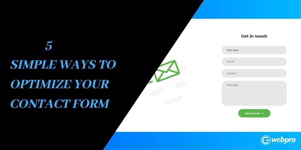
The very first look at your contact form should invite the visitors to take further steps necessary for a purchase. It should give a feeling that it’s easy and not at all time-consuming. To add all these qualities to your form, you need to increase the size of the fields and decrease their number. Too many fields dissuade the users and make them hesitant to advance through the process. Besides, you should design the form with easily readable texts.
Create Several Ways to Contact
No matter how many landing pages you have, you should create multiple ways on your site to connect you. If you provide services, you should display your contact number clearly in several pages. And if it’s an eCommerce site, you should highlight your location finder so that it becomes easy for the visitors to find you. Providing various ways to contact you is beneficial as it not only helps gain trust but also encourages user’s engagement.
Generate Automatic Field Corrections
When you are making online conversation, it is very important to pay attention to user experience. If someone skips a mandatory field, it should turn into red immediately. It is very frustrating if an error message is delivered after the visitor is done with the entire form.
Useful Messaging
The form on your website is not only meant for contacting you. It’s also an effective way to showcase the value of your company. It is actually futile to add a paragraph just above or beneath the form as most users will not find it necessary to read. Rather, you can send messages right after the completion of filling the form. Don’t finish your message by just saying that “we will contact you soon”. These kinds of phrases don’t have much appeal to the visitors. Rather give them a specific timeframe within which you will contact your visitors. Apart from this, try and create expectations in users’ minds by informing them about your specialties.
Add a Captcha Code
It may happen that you get numerous leads but none of them are responding when you contact them. It can be a case of spam leads and to avoid it, you should use captcha codes that can filter out the qualified submissions. What you need to keep in mind is that the captcha code should not be so difficult that the users find it unreadable. A combination of letters and phrases in different sizes and fonts will do the work for you. Even you can use images in it.
Before you start designing your contact form, you should put yourself in the place of a visitor and think logically how a user-friendly form should be. You can also have a look at several other forms and get ideas from them.
