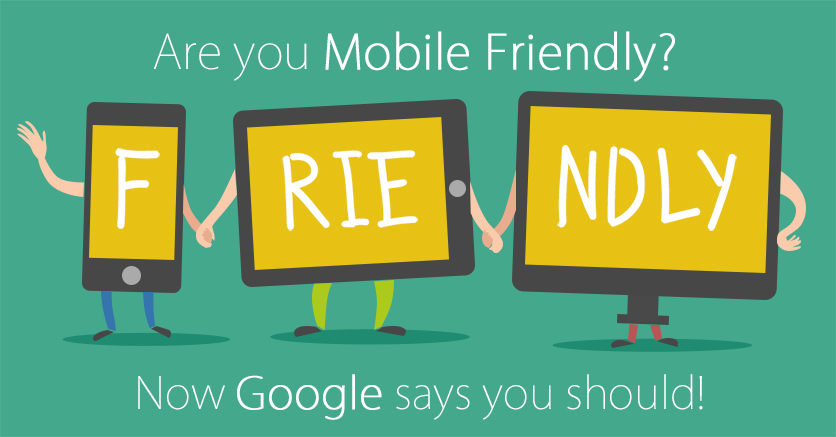
Image Credit: Business Catalyst Blog
Are you planning to give a new look to your existing website this month? Are you all-set to gift your business a new website shortly or later this year? Before you finalize on the layout and design of your website, give a thought on Google’s recent announcement. The search engine giant has again tightened the rules for ranking websites. Expecting even more mobile-friendliness, Google has floated yet another pronouncement on 16th March 2016:
With evolution of more and more varieties of handheld smart phones having different screen sizes, website owners need to become smarter. Mobile users are getting increasingly dependent on mobile internet. Google too has something new this year for all its users and website owners.
Consequent to last year’s pronouncement, Google states that by the beginning of May, it will start rolling out an update to mobile search results that increases the effect of the ranking signal to help all its users find only relevant pages that are mobile-friendly. If your website is already mobile friendly, then you will not be affected by this update. Again, older websites that are exceptionally popular due to brand value, number of years in the industry, consistent goodwill and trust, will not be affected by Google’s new ranking method.
Unfortunately, if your business is new and you haven’t been able to establish the optimum brand trust through your web presence, then its time your website gets a fresh look which complies with Google’s latest ranking strategy. Wondering how to begin? Make the first move right away by checking out the following sites:
Even a page with high-quality content can be rejected if it is not mobile-friendly. Still wondering whether your web pages are mobile-browsing-ready or not? We have summarized the 5 main pointers which serve as a checklist for you.
- Blocking of CSS or JS Resources – Check whether your site is blocking Image, CSS, and JavaScript resources against Google’s webmaster guidelines. You must ask your developers to resolve with this issue to save your website from Google’s disregard.
- Site contains very small fonts – Text content should be readable and displayed in normal to large font sizes. Google recommends a base font size of at least 16 CSS pixels for convenience mobile screen viewing.
- Less space between links or buttons – Make sure the buttons have neat edges and are adequately distanced from each other so that a person operating from a small-screened mobile device does not keep touching the wrong button. Buttons must have a height and width of at least 7mm (or 48 CSS pixels). No other links or buttons should be positioned within 5mm (32 CSS pixels) of one button.
- Inner pages are not mobile-friendly – Not only the home page or the main landing pages, all the inner pages including forms and images should be visibly mobile-view compatible.
- Content is too wide – The content should be sized and aligned in a manner that the entire chunk of text is inside the screen; nothing must spill over or become invisible despite scrolling left and right. Text and graphics alignment should be tidy and homogenous in all pages.
It’s time you ask Toronto website designers to develop a website that is perfect for mobile devices. You must aim at maximum conformity to Google’s updated filtering method. If you need to learn more, read what Google developers have said on their own website.
